First day cover ·
Layering Grunge Textures and Blood Splatter for an Eerie Photo Composite
A layered Photoshop composite built from grunge textures, blood splatter brushes and soft light blend modes, with a cold grade planned as the final step.
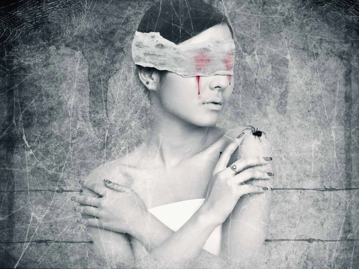
This composite is built from separate stock elements stacked into one dark, unsettling frame. Nothing in it is a single photograph. A grunge texture supplies the base, a second texture adds depth, and brush-based splatter gives the surface a sense of violence. The tutorial's stated goal is a cold color tone applied at the end, and the blend-mode choices made earlier determine how well that grade holds up. If the textures are muddy before the grade, no color treatment will rescue them.
Materials Used
The stack draws on a small set of sources. Both grunge textures come from darkrose42-stock on DeviantArt. The figure is a model photo from Adobe Stock. The splatter comes from two Photoshop brush sets, one dried and one glossy, both from Photoshop Tutorials. The cobweb brushes come from Obsidian Dawn, the cobweb texture from Fantasystock, the wire from Morguefile, and the bandage from Titelgestalten. Downloading everything before you start saves a lot of tab switching later.
- Grunge texture 1, by darkrose42-stock
- Grunge texture 2, by darkrose42-stock
- Model, via Adobe Stock
- Dried blood splatter brushes, via Photoshop Tutorials
- Glossy blood splatter brushes, via Photoshop Tutorials
- Cobweb brushes, by Obsidian Dawn
- Cobweb texture, by Fantasystock
- Wire, via Morguefile
- Bandage, by Titelgestalten
Building the Base Canvas
Start with a 1333 x 1000px document filled with white. The size and background color matter less than they seem, since the grunge textures will cover the canvas, but a white base makes it easy to see where the textures end. Drag the first grunge texture in with the Move Tool (V), resize it to cover the frame, then choose Edit > Transform > Flip Horizontal. The flip matters more than it looks. Mirroring a texture breaks up a repeating pattern that the eye would otherwise catch, especially in a large dark area.


Next, press Cmd/Ctrl+Shift+U to desaturate the texture. Working in grayscale keeps the color decisions for the final grade, where they belong. Trying to build contrast in color first usually produces a grade that fights the texture instead of supporting it.

Layering the Second Texture
The second grunge texture goes in the same way: resize, transform, flip. The tutorial uses only the center portion of this texture, which is a sensible shortcut. The edges of stock textures often carry strong vignettes or obvious scan artifacts, and the center usually holds the cleaner, more usable detail. Crop or mask to that central area so the edges don't pull the eye away from the figure.
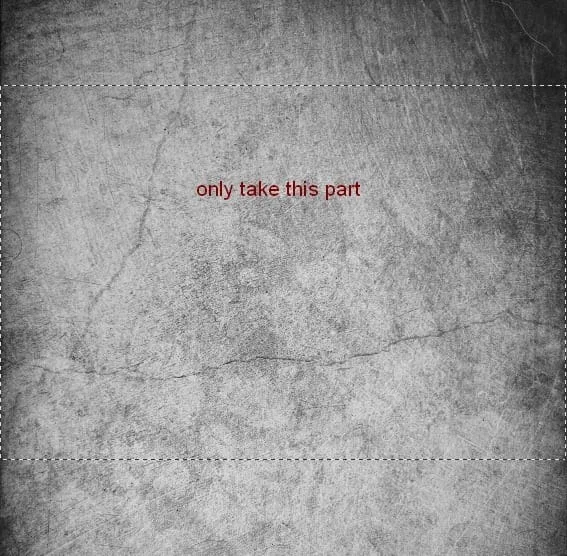
Set this layer's blend mode to Multiply at 50%. Multiply darkens everything it touches, so the texture adds shadow and grit without washing out the base. At 50% opacity, the texture reads as surface wear rather than a pattern laid on top. If the result looks too heavy, lower the opacity further before touching anything else. Most of the mood in this kind of image comes from restraint at this stage.
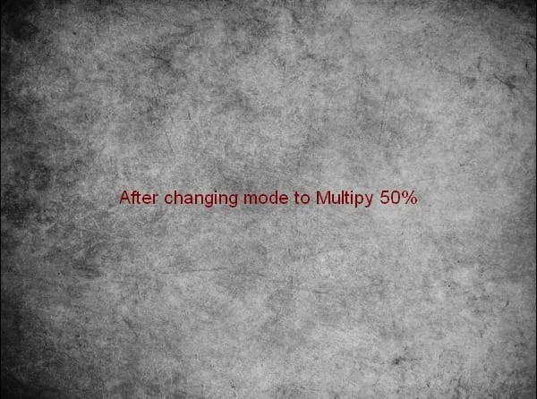
Repairing the Carved Circle
The background has a carved circle along the right edge that needs to go. Add a new layer with Cmd/Ctrl+Shift+N and select the Clone Tool with S. Hold Alt and click on a clean source area, then paint over the circle. Working on a separate layer lets you undo or adjust without damaging the textures underneath, and sampling from nearby grunge means the patch picks up matching tone and grain.


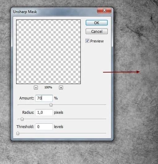
Cloning tends to soften the area, and that's the trade-off here. Go to Filter > Sharpen > Unsharp Mask to bring the detail back. Don't push it too far. A grunge background hides imperfections well, so the goal is only to stop the patch from reading as blurry. The tutorial makes this point directly: you don't need a spotless repair when the surface is meant to look worn.

Building the Splatter Layers
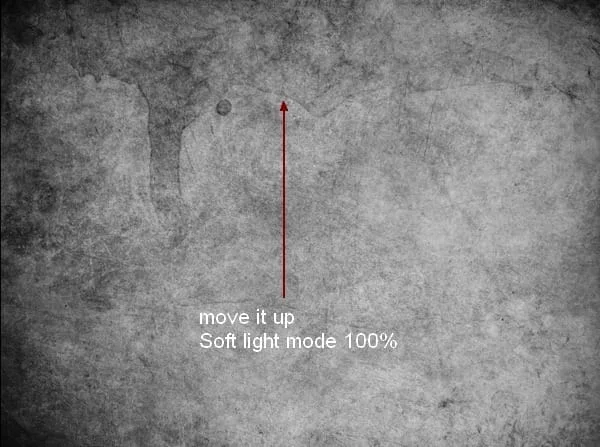
The splatter is where the image gets its menace, and it's built in stages rather than in one pass. Create a new layer, set the foreground color to black, and pick a dried blood splatter brush. Stamp a shape onto the upper portion of the canvas. The brush choice is a matter of taste: a bolder, more irregular shape anchors the composition, while finer droplets read as residue. Then change this layer's blend mode to Soft Light at 100%.

Soft Light is a good choice for this kind of texture because it darkens and lightens based on the underlying tones, so the splatter stays subtle in the midtones and reads more strongly where the base is already dark. If the splatter looks too heavy, reduce the layer opacity or duplicate the brush stroke at a different size and position. Stacking a few smaller strokes often looks more natural than one large, heavy mark.
Next, add another new layer and use the first brush in the pack to paint across the left side of the background. Set this layer to Soft Light at 50%, then duplicate it and move the copy to the right. The mirrored placement balances the composition so the splatter doesn't cluster on one side. Two layers of similar marks, placed at different opacities, look like accumulated damage rather than a single deliberate effect.

For the finishing splatter, work with two or more layers of small droplets. The tutorial sets one layer to Soft Light at 50% and another to 100%, which creates a range of intensities across the scene. Add a layer mask to each one and paint with black where a droplet sits on the figure's face or hands, or where it competes with the focal point. Masking is the difference between splatter that supports the subject and splatter that distracts from it.
Where the Cold Grade Fits
The cold color tone is the last piece of the look, and it only works if the layers beneath it are already balanced. Cool grades amplify whatever is present, so muddy textures and heavy splatter become muddier and heavier under a blue or teal shift. Before grading, check the image in grayscale. If the values are clear and the figure separates from the background, the color treatment will add atmosphere. If not, return to the masks and blend modes first.
The approach here, building depth with stock textures and then adding color last, is a practical template beyond this one image. Once you understand why Multiply handles surface grime and Soft Light handles blotchy accents, you can swap in different textures, brushes or figures and keep the same logic. The result will look like a single considered image rather than a collage of parts.