First day cover ·
Dramatic Light for Fantasy Composites: Building the Scene Before the Glow
Set up a fantasy composite on a moody dark-blue base, desaturate the background with clipping masks, and lock in the scene before adding any light.

Most fantasy composites fail at the light, and the cause is usually the groundwork rather than the glow. If the backdrop is too colorful, a beam of light has nothing to push against, and the subject ends up looking pasted on. This walkthrough builds the scene in a deliberate order: a dark base, a library placed and toned down, and a floor that matches. Once that foundation is set, the light and the semi-transparent fabric work that follows has something believable to sit in.
What You'll Need
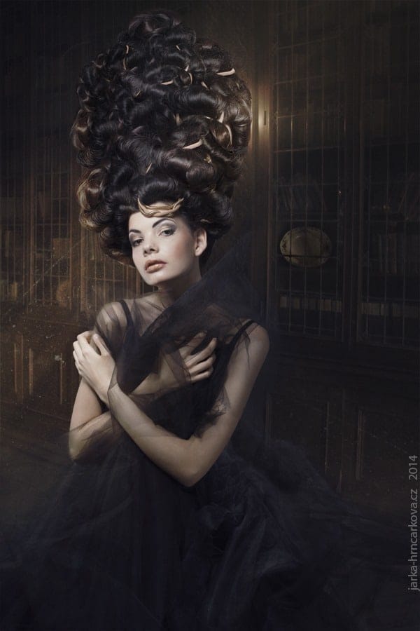
The resource list includes a library stock image, a woman with hair and dress assets, mist and sun ray brushes, a dust texture, and a light texture. Mist and sun ray brushes are the two that matter most for the look. Mist softens the far end of the room, and sun rays give you a directional source that the rest of the image can be lit to match. Dust and light textures add the grain of a real air volume, which is what usually separates a finished fantasy scene from a clean digital collage.
- Library by Cats-go-moo-always
- Woman, hair and dress
- Mist Brushes by pelleron
- Sun Rays Brushes by pelleron
- Dust Texture by boxx2genetica
- Light Texture by stock-basicality
Starting With a Dark Base
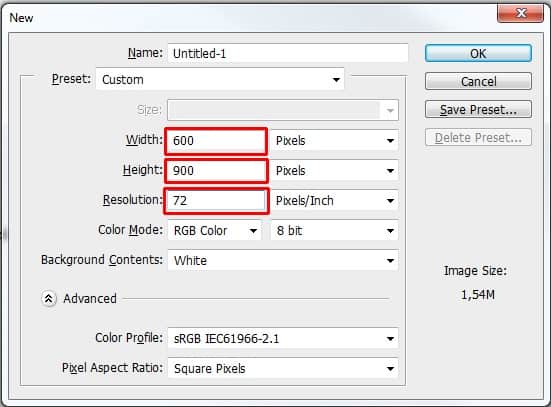
Create a new document at 600 by 900 pixels with the resolution set to 72 pixels per inch. That canvas is a portrait format that suits a single figure, and it's small enough to keep the file light while you test. If you plan to print at a larger size later, raise the resolution at the start rather than upscaling at the end, because upscaling softens the edges where your light will eventually sit.
Fill the background layer with a dark blue, #2b2b32 in this case. The choice matters more than it looks. A near-black blue reads as shadow with a cool cast, so a warm light source introduced later will stand out sharply against it. Pure black tends to swallow the mist and dust layers, while a brighter base makes every glow look like a lamp rather than a beam.
Placing and Toning the Library
Drag the library image in, rename its layer LIBRARY, and move it to the top of the stack. Use Free Transform (Ctrl+T) and hold Shift while scaling so the proportions hold. Press Enter to commit the transform. Scale the image to fill the canvas, because any gap you leave will show up later as a seam the light can't hide.
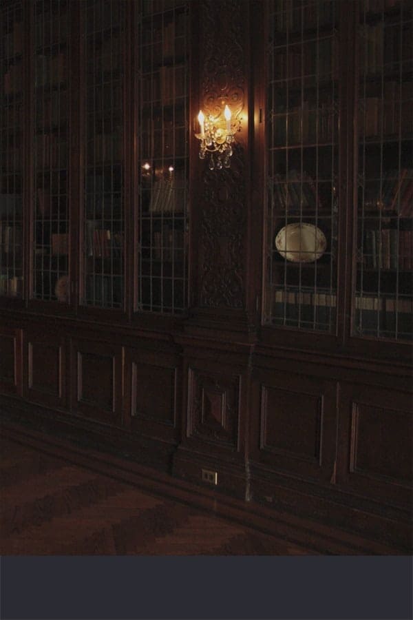
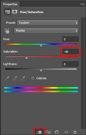
Next, add a Hue/Saturation adjustment layer and drop saturation to -40. Then clip it to LIBRARY so the change touches only that layer. This is the step that does the quiet work. Desaturating the background pulls the eye toward the subject and keeps the library from competing with the figure. It also gives the later light a neutral surface to color, which makes the glow feel like it's interacting with the room rather than sitting on top of it.
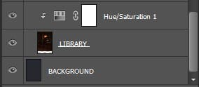
Check the layer order before going further. A clipped adjustment that sits in the wrong position will quietly apply to the wrong layer, and it's far easier to catch that now than after you've painted in three layers of light.
Building the Floor
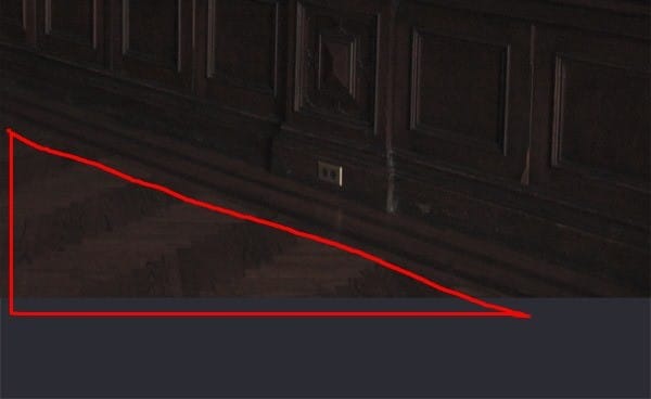
The woman is going into the bottom left, so the floor on the bottom right is the piece to fix. Select the LIBRARY layer, grab the Lasso Tool (L), and trace the floor area you want to keep. Copy it with Ctrl+J, move the new layer to the top, and rename it FLOOR. Then move it with the Move Tool (V) until the perspective matches the rest of the room.

Treat the floor the same way you treated the library. Add another Hue/Saturation layer at -40, clip it to FLOOR, and keep the two surfaces consistent. Mismatched saturation between the wall and the floor is one of the most common tells in composites, because the eye reads the room as two separate photographs.
Where the Light Goes Next
At this point the scene is neutral and controlled, which is exactly where you want it. The rest of the walkthrough moves into the light itself and into blending semi-transparent fabric, which is the harder part. My read is that the fabric will be the test. Sheer material picks up light from behind and scatters it, so a glow that looks right on a solid surface can read as wrong once it passes through cloth. Keep your sun ray and mist layers on separate groups so you can adjust their opacity without rebuilding the mask each time.
Here's the practical takeaway: lock in the base, the desaturation, and the floor before you touch a single light layer. A dark blue backdrop, clipped adjustments, and a consistent surface give the glow something real to react against. Get that right, and the dramatic light does most of the work for you.